Walmart’s “Underwhelming” Logo Redesign Is Actually a Brilliant Move—Here’s Why

As someone who’s spent over 20 years in the branding space, I can tell you that the latest update to Walmart’s logo isn’t just another redesign—it’s a brilliant marketing move that’s getting millions of dollars worth of media attention for free.
Let’s be clear: When you’re a behemoth like Walmart, with over 1.6 million employees and a brand valued at over $735 billion, you don’t need to make bold, sweeping changes to your logo. In fact, you’re better off making subtle tweaks that stay true to your legacy but speak to a new generation of consumers.
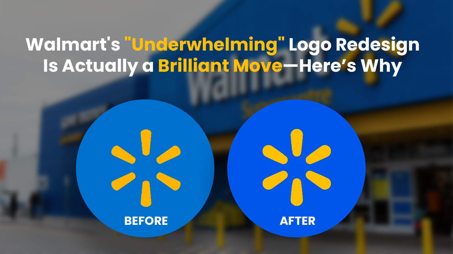
That’s exactly what Walmart did with its recent logo refresh, which has the internet buzzing—many questioning, “What changed?” In fact, a lot of people online are laughing about how “subtle” the changes are. “It looks the same,” some said. “Is this a joke?” others quipped. But here’s the thing: the subtlety is precisely the point.
Walmart’s “spark,” which first appeared in 2008, has now been redrawn with organic curves that feel more approachable and less rigid. The palette of true blue and spark yellow still dominate, but the blue is a bit brighter—arguably a more modern shade. And, the font is now thicker which feels simple, clean, and far more optimized for digital spaces.
On the surface, it might seem like nothing’s changed, but for Walmart, this is genius. Why? Because they’ve turned a minor brand revision that everyone makes and turned it into an entire PR moment. Everyone is talking about it. They’ve sparked a conversation across social media, design forums, and news outlets—all without alienating their core customers or taking any major risks. This is a textbook example of a “soft” rebrand that creates massive buzz and drives engagement without the burden of a complete overhaul.
What’s more, these changes are part of a larger, long-term strategy to evolve in the digital age. The old logo wasn’t as optimized for digital platforms, but this new one? It works perfectly on screens, and that’s crucial when nearly everything a brand does today is seen through a mobile device or laptop. These small tweaks are far more than aesthetic—they’re about positioning Walmart for the next 10 to 20 years. What seems small now if feeding a long term revolution.
For those criticizing the design as “underwhelming,” I’d argue that these very “subtle” differences are what make the update so impactful. In the branding world, it’s easy to go for flashy or radical. But a company of Walmart’s stature understands the power of consistency. They’ve carefully honed their visual identity to appeal to the sensibilities of today’s consumers without losing what made them iconic in the first place.
As someone who’s been in the branding industry for decades, I can appreciate the thought that went into this. Walmart didn’t need to reinvent the wheel—they needed to fine-tune the ride, and that’s exactly what they did.
So, next time you see someone criticizing the new Walmart logo, remember this: Subtlety in branding isn’t a weakness. It’s a strategy. And when executed right, it can make waves in ways you’d never expect.
What do you think of Walmart’s new logo? Subtle genius or missed opportunity?
Let’s discuss.
Book a free discovery call with me to discuss your brand at the following link: https://shorturl.at/jJvSh